Vibrant Summer Color Palettes for Acrylic Painting
One of my favorite ways to celebrate the seasons is through color! And summer? Oooh, she brings the heat with bold, vibrant hues that just make your heart happy. From cotton candy skies to seaside escapes, there’s so much inspiration to pull from this season!
Whether you’re looking for a burst of color inspiration, or are planning your next acrylic painting, these summer color combos are sure to spark some magic!
Here are four palettes I’m absolutely loving this summer!
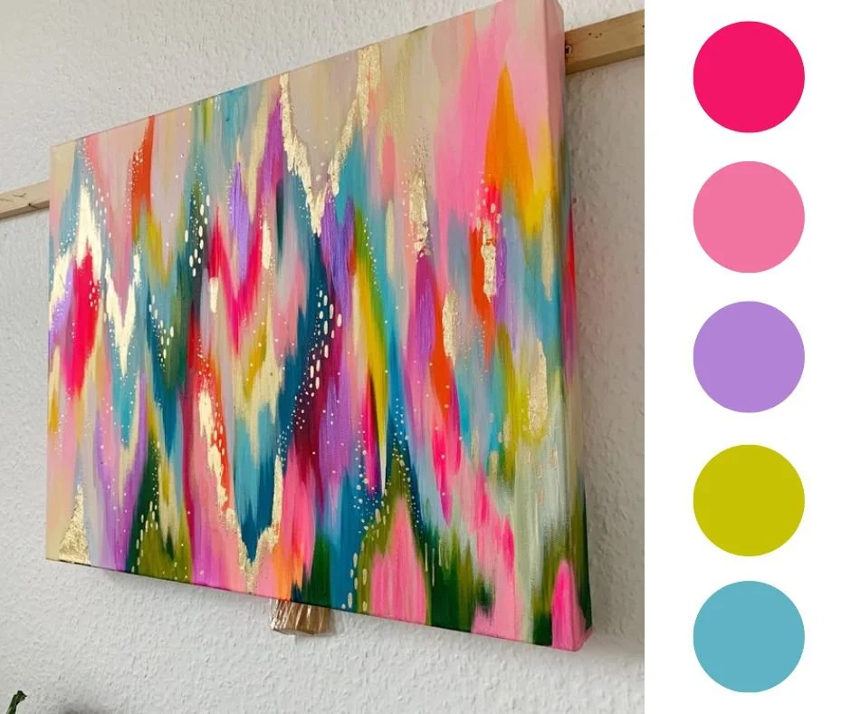
🌸 Pinks & Corals
Inspired by the vibrant bouquets and bursting blooms of summer, this palette is one of my go-to’s for floral pieces! I used this combo in one of my peony paintings and I love how it turned out. The vibrant coral and fluorescent pinks bring a sunny energy to the piece, while the hits of periwinkle and green give it a great contrast!

If you’ve been around for a while, you know I love a hot pink. She’s one of my favorite go-to hues! It adds an instant energy boost to any piece, and I think it’s a must-have color in your kit. If you want to learn more about how I use fluorescent pink in my paintings, check out this blog post about hot pink color palettes for even more inspo!
🌊 Coastal Blues
There is something so calming about the ocean, and using an ocean-inspired palette in your art can have the same effect. This palette pairs cool aqua tones with deeper ocean blues and sea-glass greens. It's grounding and calming on its own, but you can explore adding an extra layer of energy to it by adding some unexpected hues like I did in this example!

🌈 Rainbow Riviera
One of my classic series’ of original paintings is called “Rainbow Riviera.” I drew inspiration from the colorful homes along the Mediterranean coast, and I absolutely love the freedom this type of palette gives you. You can take it in a pastel direction or experiment with bolder, brighter tones. Or you can be like me and do both! A rainbow palette always brings a bold, cheerful energy to a piece which is why so many of my pieces feature all the colors of the rainbow!
Need help mixing vibrant shades like these? This post on vibrant color mixing with acrylic paint has some of my favorite tips to get rich, eye-popping hues even when starting with a limited set of paints.
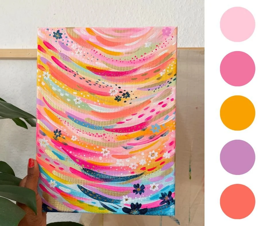
🌅 Sunset Hues
Inspired by cotton candy skies, this palette uses pinks, oranges, and purples to capture the energy of those late summer sunsets. I’d encourage you to use this palette as inspiration, but also to go out into nature and discover a palette of your own. The beauty of sunsets is that no two are alike, so you’re bound to get fresh inspo every time you catch one! Plus, you’ll get the added benefit of enjoying a beautiful, quiet moment to yourself!
Color is such an important part of creating art, and it’s one of my personal favorite ways to express myself. I love the way that color can bring up emotions and truly make you feel something magical. I always aim to bring a sense of joy with my art, and a huge part of that is through the colors I choose!
If you want to learn more about painting intuitively with stunning, vibrant colors, I’d love to invite you to join one of my classes! I have a whole library of painting classes that will walk you through my colorful process step-by-step. I hope to see you in class!

Happy painting!
xo, Jessi