Acrylic Underpainting Techniques
When you think of acrylic underpainting, you typically think of oil paintings and the old masters. But what about modern abstract paintings? Do they need an underpainting?
In this post, I’ll share how I use underpainting for my signature colorful fine art so you can decide whether or not you want to experiment with underpainting in your own work!
What is an acrylic underpainting?
An underpainting is exactly what it sounds like - it’s an initial layer of color that you apply as the first layer of your piece.
What are the benefits of starting with an underpainting?
There are lots of reasons that artists start with underpainting. Sometimes it’s helpful to have something on the page so that the blank canvas is less intimidating. It also can be used to map out your composition in advance.
And even though the underpainting typically gets covered by the rest of the layers, it can be fun to see little pops of it peek through, adding interest and unexpected touches to your piece.
Lastly, it can be used as a tool to gauge the value of the colors you’re painting with. Many artists start with a mid-tone underpainting so that they have an idea of what lighter and darker values look like against it.

Here are two examples of how I use underpainting in my colorful abstract work.
Example #1: Vibrant Undertones
In this example, I painted a vibrant poinsettia flower and started with a fairly opaque yellow underpainting. The idea was that the yellow would brighten up the piece even though I was going to paint over it with more traditional poinsettia colors in the red and green color families.
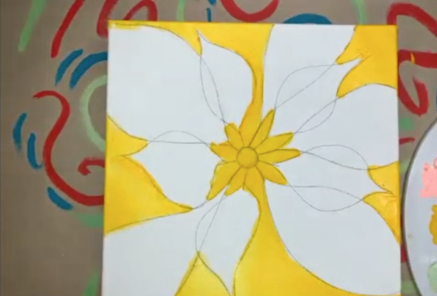
The fun part about this project was that I intentionally let pops of the yellow color shine through as I painted the subsequent layers.

You might think that those little pops of yellow would distract from the overall cohesiveness of the poinsettia painting, but they actually added so much interest, depth, and variation to the final piece.
Experiment with adding an underpainting in a completely unexpected tone to your next piece and see how it goes! Underpainting with a lighter value will bring an extra layer of brightness to your piece. Starting with a darker underpainting will give it more depth.

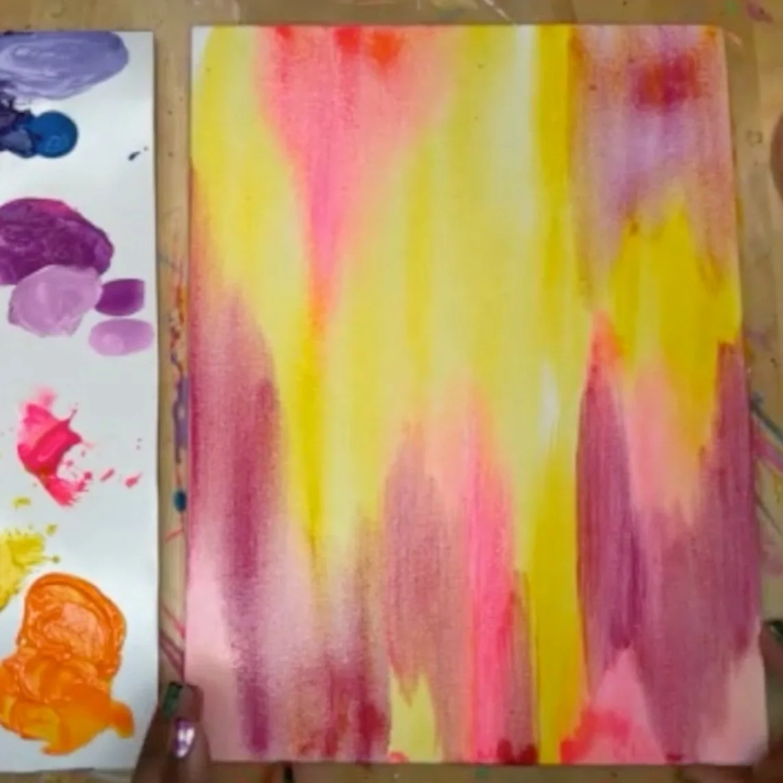
Example #2: Composition Mapping + Texture
This next example is the most common way I use underpainting in my abstract acrylic pieces. When I paint in my signature brushstroke style, I like to paint intuitively, but it’s helpful to have a loose composition mapped out ahead of time.
To do that, I start with a watery wash of acrylic paint to map out the general composition. Unlike the example above where I used a color that was totally unrelated to the final piece, in this case, I use colors that fit into my general vision for the color palette of the painting.
My paintings typically follow a V-shape composition so I loosely sketched out a dripping V-shape across the canvas. You can learn more about abstract art composition in this blog post!
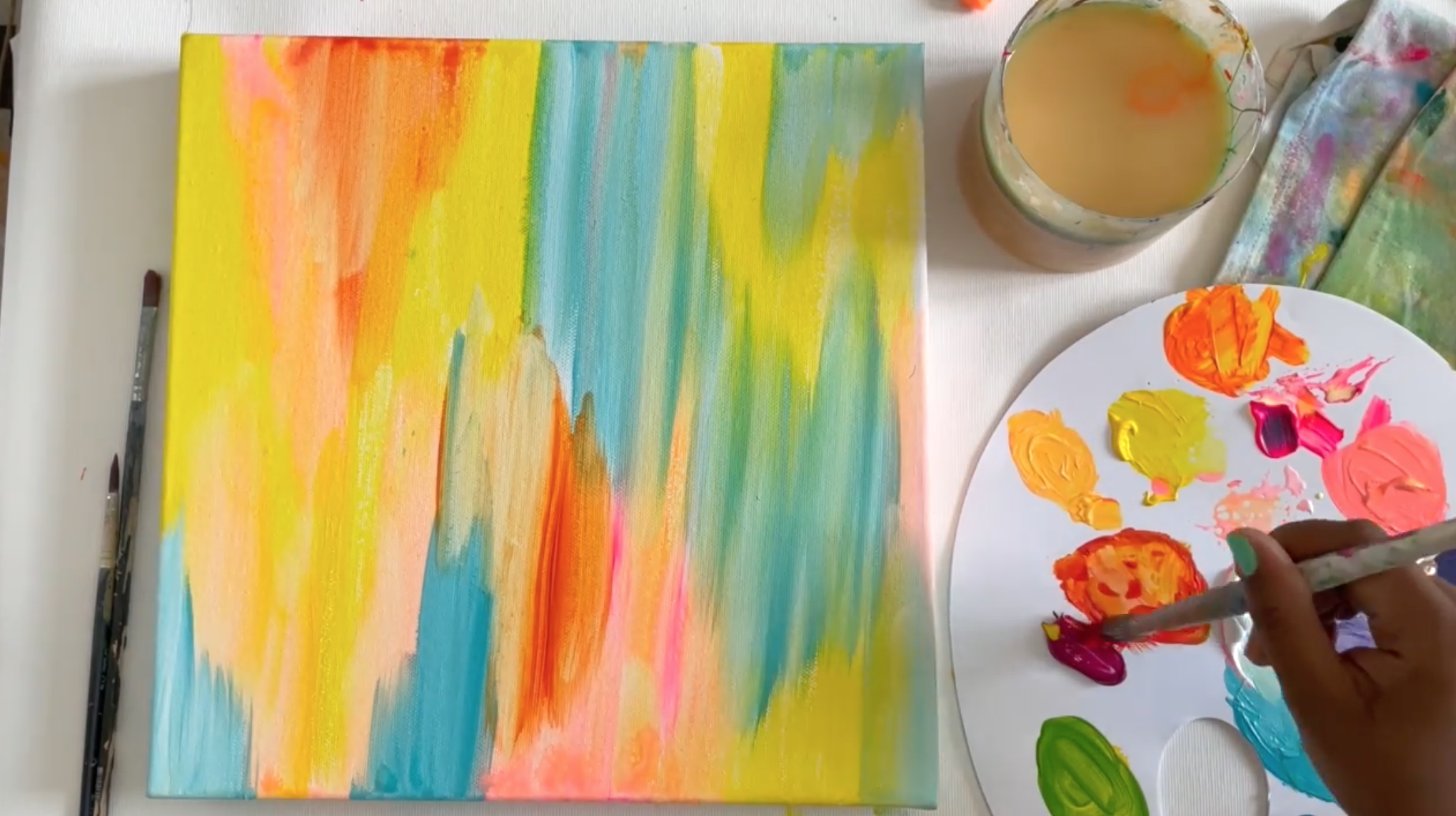
I let bits of the watery underpainting peek through in the final piece. This adds extra texture and interest to the painting so it’s not all flat color.
Here is how the final piece turned out from that underpainting!

Whether you’re using underpainting to map out your composition or as a tool to provide extra depth to your artwork, it can be a handy technique to experiment with.
I hope this post was helpful! If you want to learn more about abstract painting and how I use underpainting to make my paintings pop, check out my class, Joyful Abstracts on Skillshare!
You’ll learn how to gather inspiration, how to sketch out your composition, what colors to choose, how to paint a balanced abstract, and how to varnish your painting so it will last a lifetime!
xo, Jessi

Pin this post for later! 📌
Hover or tap on this image and click the “Save” button on the top left!
