Determining Warm vs. Cool Colors
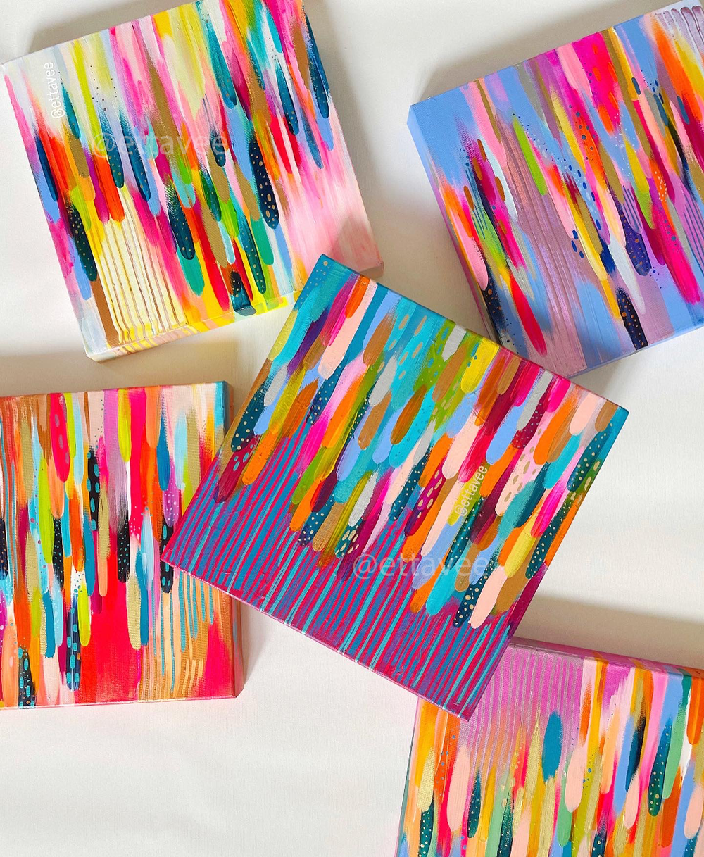
If you know me, you know I am color-obsessed! My signature style celebrates color and the joy that a vibrant palette can bring to the viewer.
In today’s post, I’m going to walk through the difference between warm and cool colors and how identifying them can help you in your painting process.
Oh, and before we dive in, I have an assortment of color-mixing blog posts to help you learn the basics of mixing vibrant colors with acrylic paint. You can check them out here:
Why do you need to know whether colors are cool or warm?
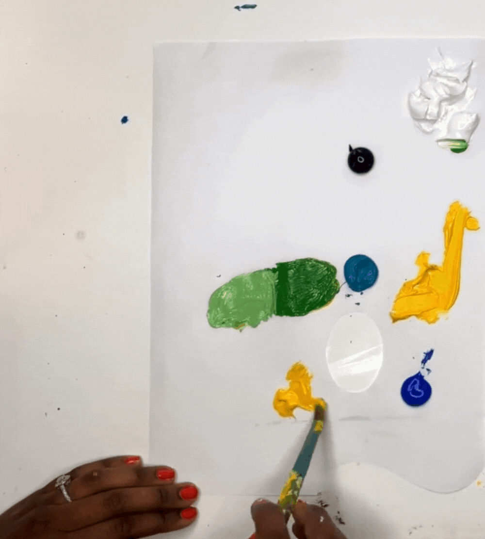
First of all, let’s talk about why it’s important to determine whether a color is cool or warm. As an artist, color mixing is one of the fundamental skills to learn. It will open you up to a rainbow of color possibilities with just a few main colors as your starting point.
If you have both cool and warm primary colors in your art supply kit, it will help you mix an even broader range of colors.
It’s helpful to be able to identify warm and cool colors so that your beautiful color mixes don’t turn out muddy. For example, mixing a warm blue with a cool yellow will result in a muddy green because the warm blue contains some red and the cool yellow contains some green.
Red and green are complementary colors, meaning they are opposite on the color wheel and when mixed, they make black. If there are hints of complementary colors in the two colors you’re mixing, it will often lead to a muddier and duller hue.
If that’s the look you’re trying to achieve, that’s totally fine! But it’s helpful to know which colors are warm and cool so you can achieve the perfect hue in your color mixing.
How to determine if a color is cool or warm
Here is the simplest way to identify warm vs. cool colors:
Warm colors will have more red and orange tones.
Cool colors have more green and blue tones.
This is not to say that all warm colors are in the red and orange family or that all cool colors are in the green and blue side of the color wheel. You can have cool reds and warm blues. It’s all about whether or not the color contains more red/orange or more green/blue.
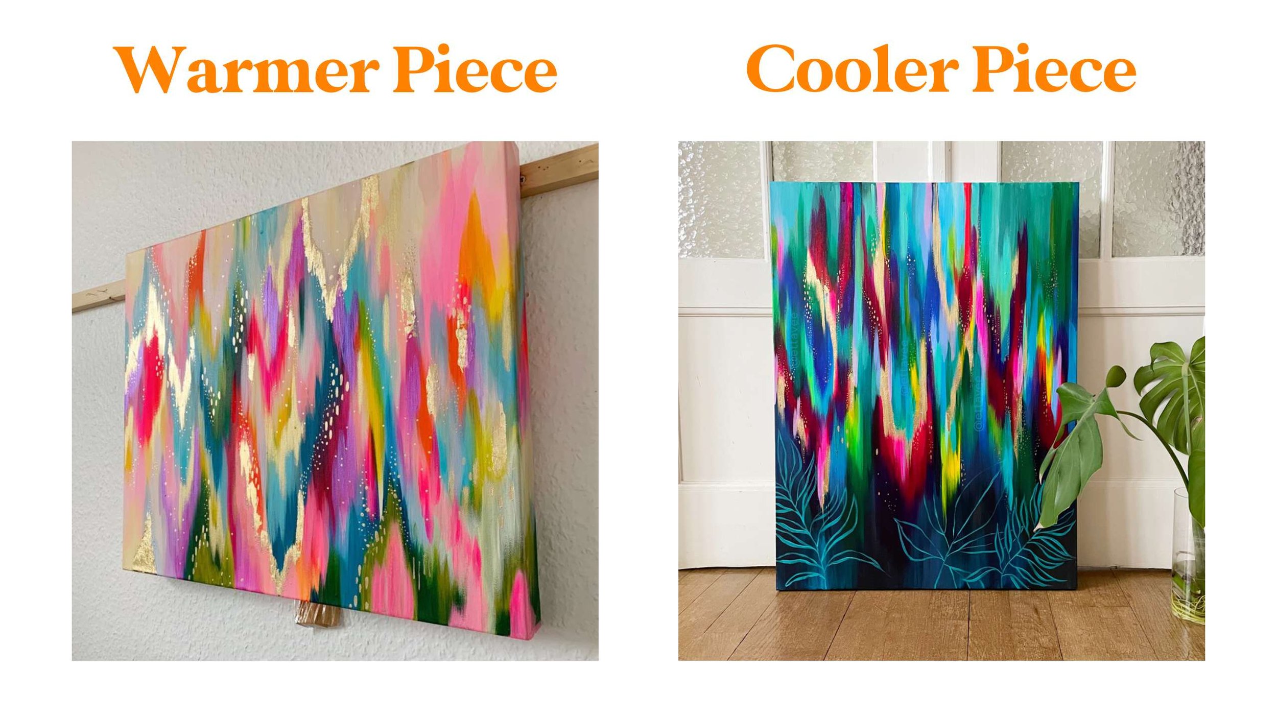
For example, a warm blue will have more of a red undertone. It will likely appear to lean more toward purple than pure blue.
A cool red will include more blue tones like a Quinacridone Magenta.
A fun exercise to try is to swatch the primary colors in your kit (reds/magentas, blues, and yellows) and try to identify which ones are cool and which ones are warm. True primary colors tend to land smack dab in the middle of the cool/warm spectrum, so keep that in mind if you have any true primaries in your kit.
Then you can explore mixing your cool and warm primaries to see what kinds of colors you come up with.
How I use this knowledge in my abstract paintings
I am an intuitive painter, and most of the time I’m mixing my colors on the fly. Knowing which colors will pair well together and make a pretty hue is really helpful. This way, I can keep up with the inspiration as it comes to me and know that the result will look nice.
At the end of the day, it’s best to explore and identify what you like so that you can let your unique voice shine in your paintings.
If you need some tips for acrylic paint mixing, check out this blog post on how to mix vibrant colors with acrylic paint.

If you want to learn my abstract painting process step-by-step join me in my Joyful Abstracts Class where you’ll learn how to paint a vibrant abstract painting inspired by the feeling of joy! The class is hosted on Skillshare and you can check it out for free when you sign up for a free month trial with this link!

xo, Jessi
Pin this post for later! 📌
Hover or tap on this image and click the “Save” button on the top left!
