Relaxing Acrylic Painting Tutorial: Colorful Leaves
Looking for an easy acrylic painting tutorial? In this blog post, you’ll learn how to paint a stunning leaf illustration that you’ll be proud to hang in your home. Plus it’s a fun, relaxing, and easy painting tutorial for all levels. Whether you’re a beginner or seasoned artist, you’ll have fun following along and painting this calming piece step-by-step.
So grab your favorite drink, light a candle, pump your favorite tunes, and let’s dive in!
By the end of the tutorial, your painting will look something like this!

Note: This tutorial is for your personal enjoyment. This image is copyrighted and cannot be recreated or sold for profit.
Before you dive in, know that you have complete creative freedom with this piece. I’m giving you a structure, but you’re free to make it your own! In fact, I encourage you to do so! If you want to use different colors than me or different accent paint strokes, go for it! I can’t wait to see what you paint!
Supplies:
Note: Some of the links in this post are affiliate links. This means if you purchase something after clicking one of my links I may receive a small commission at no additional cost to you!
Acrylic paint
My favorite paint brand is Liquitex, but you can use anything you have on hand for this tutorial.
Here are the colors I’ll be using
Titanium White
Primary Yellow
Fluorescent Pink
Turquoise Blue
Prussian Blue
Something to paint on
I’ll be using a piece of heavy mixed media paper in this tutorial but you can use a canvas or whatever surface you want!
Paint brushes
You don’t need to get anything fancy here! I prefer the Simply Simmons brushes like this one. You’ll just want to make sure that you have a round brush since we’ll be using that to get the shape of the leaves just right.
Acrylic paint pens
These are optional, but they’re great for adding details and flourishes at the end of the piece. My favorite brand to use is Posca! These are especially fun to use when adding metallic flourishes to your piece!
Step 1: Mix Your Colors
Before you begin, you’ll want to mix your paint. The majority of this piece consists of turquoise and green, but we’ll be adding accent colors on top of the leaf in the middle.
For the turquoise, you’ll want to use Turquoise Blue straight out of the tube. You’ll also want to mix a light turquoise which can be achieved using Titanium White and the tiniest bit of Turquoise Blue.
For the greens, you’ll want to mix Primary Yellow with the tiniest bit of Turquoise Blue. You can also mix a deeper green by adding Prussian Blue or more Turquoise Blue. Just make sure to mix little by little so you have plenty of control over your colors!
You can also mix some warm colors like light pink, coral, and oranges for the accent colors.
If you are totally new to paint mixing and color theory, I’d encourage you to check out this post first, and then come back so you’ll be more familiar with the process!
Here’s how my palette looked before I started painting.

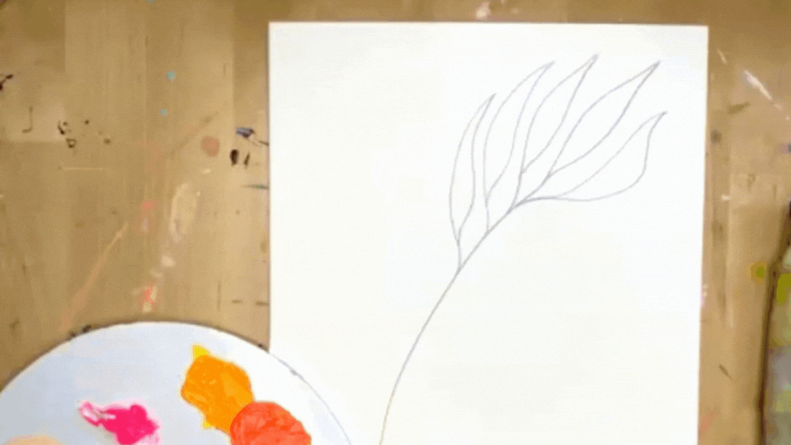
Step 2: Sketch
Now it’s time to sketch the motif! Draw a large leaf in the middle of the page with two smaller leaves curving around it.
In order to achieve the spread-out palm look, start by sketching the center stemp. Then for each leaf, draw a little stem before creating the leaf shape. This will help keep the leaves looking expressive, spread out, and natural.
Be sure to sketch lightly! Even though acrylic paint is opaque, we’ll be using a watercolor wash effect on parts of the painting. The lighter you sketch, the less likely you’ll be to see pencil marks in the final piece.
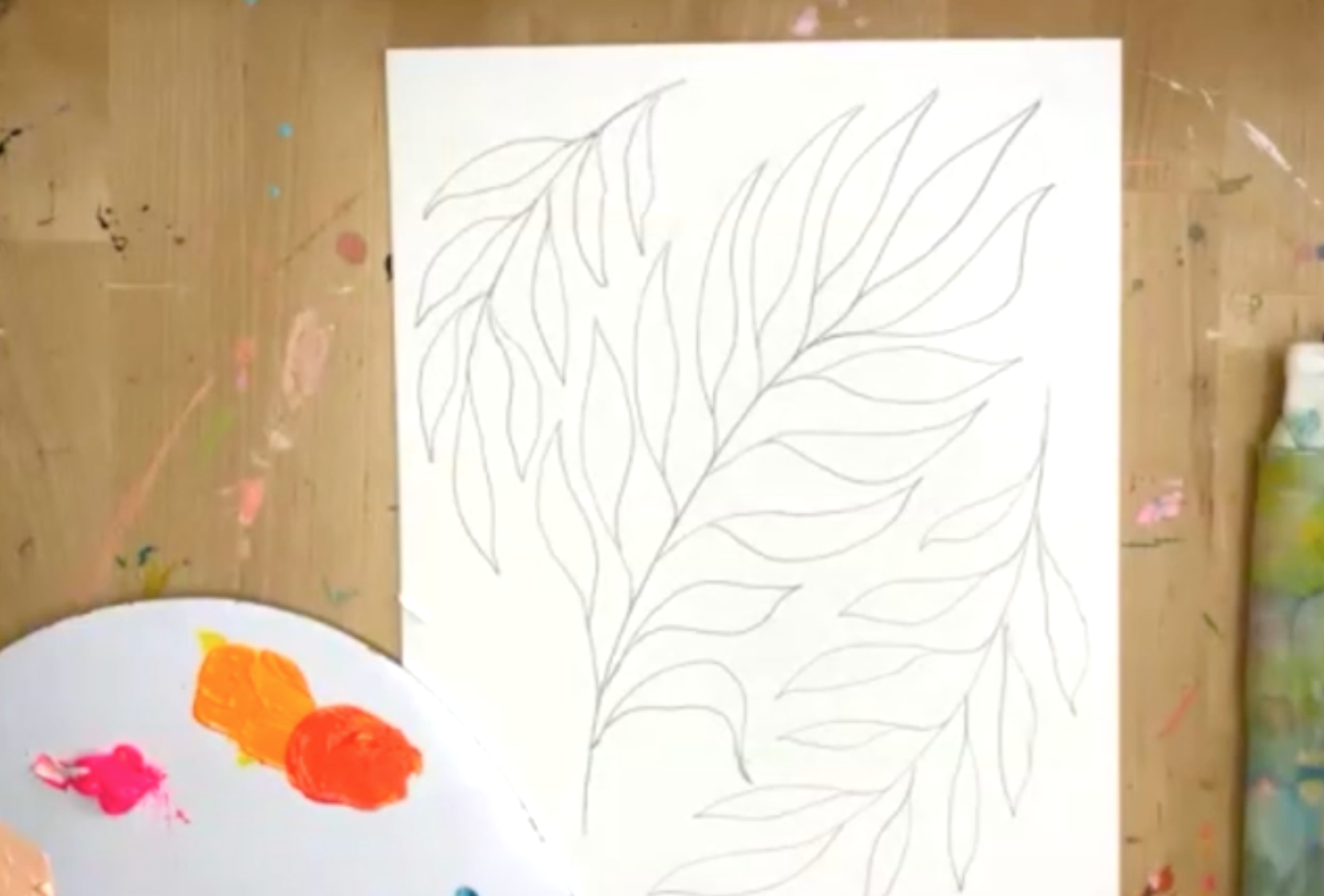
When your sketch is complete it should look something like this!
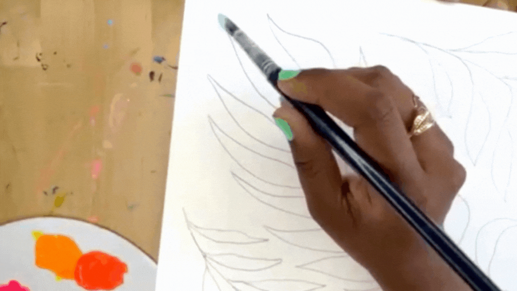
Step 3: First Layer - Watercolor Wash
Now that we have our sketch, it’s time to start painting! Even though we’re using acrylic paint, we’re going to be adding water to the paint to achieve a watercolor consistency for the first layer. This just adds some extra depth and interest to the piece and will make the center leaf really pop.
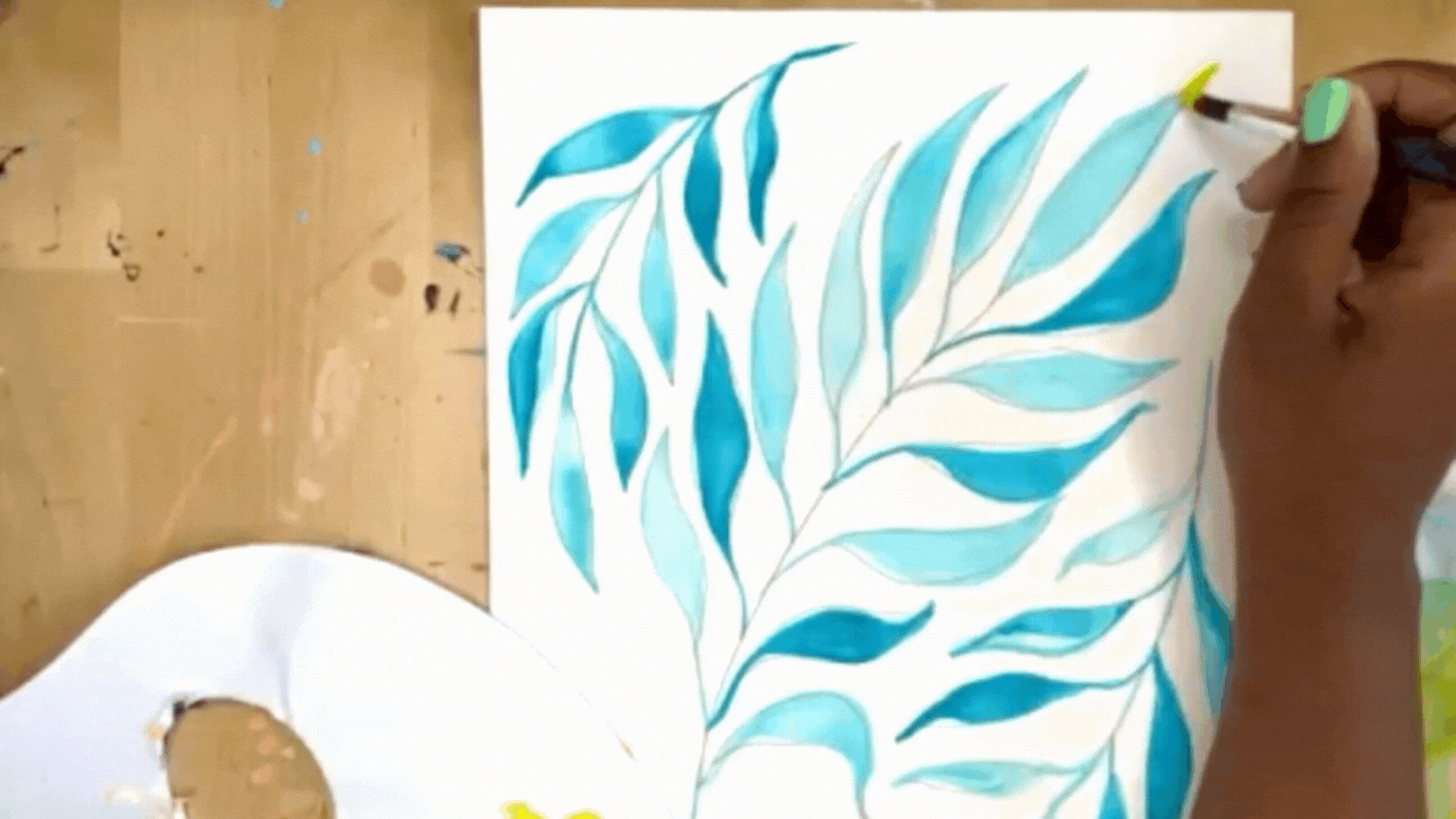
Start by adding water to your light turquoise mixture to get it nice and watery. Now load up a round brush with the turquoise. To paint the leaves, we’re going to let the brush do the work for us. Instead of outlining the shape of the leaf and coloring it in, we’re going to use our brush pressure to make the shape of leaf. You’ll go from light pressure to heavy pressure, back to light pressure.
Light pressure with the tip of the brush will create the base of the leaf, pressing the brush down harder in the center creates the main part of the leaf, and finishing with light pressure creates the leaf’s fine tip.
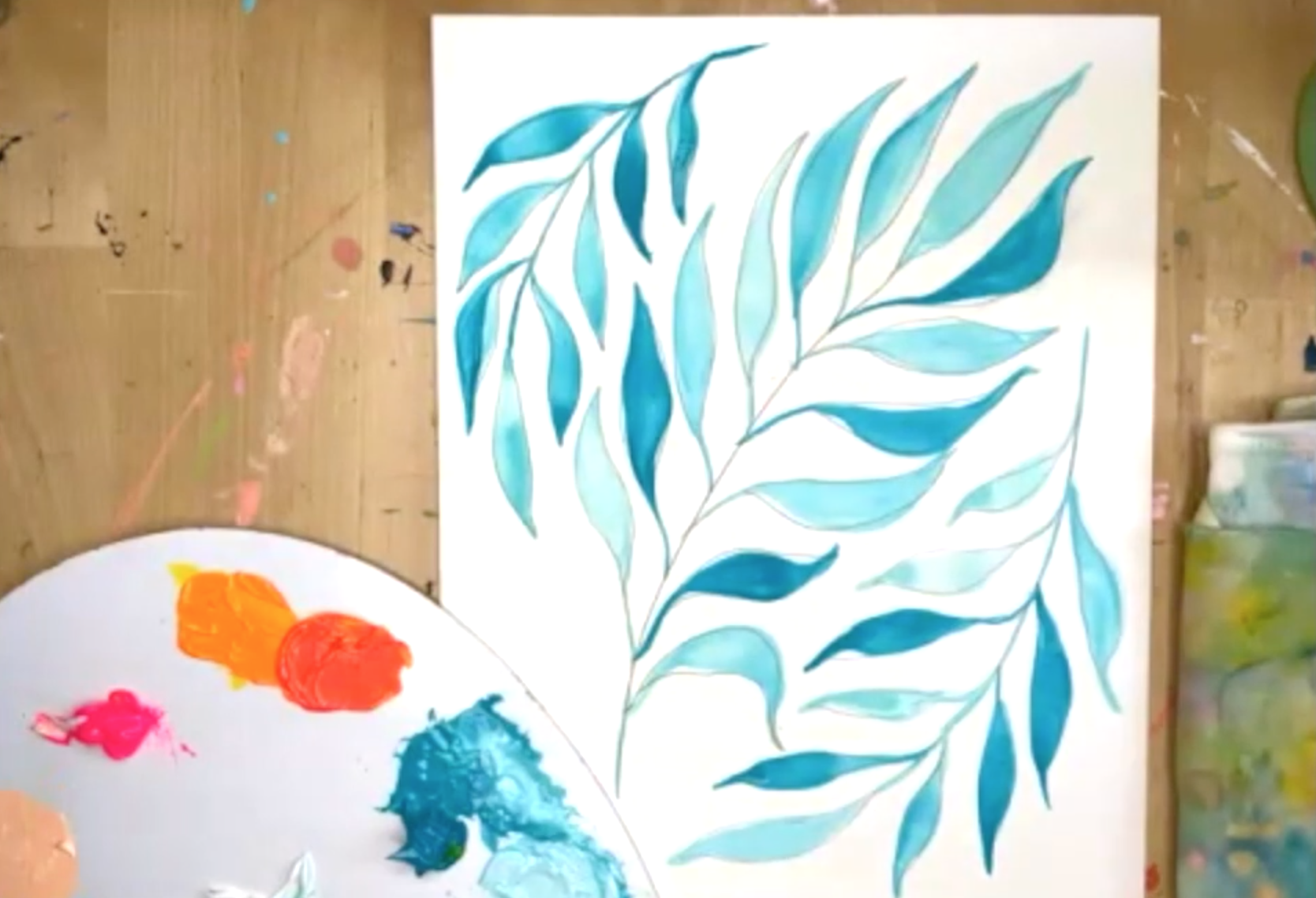
Here’s what that looks like:
You can alternate between a watery dark turquoise and watery light turquoise to achieve more depth in your leaves. Repeat this step on all three leaves until your painting looks like this!
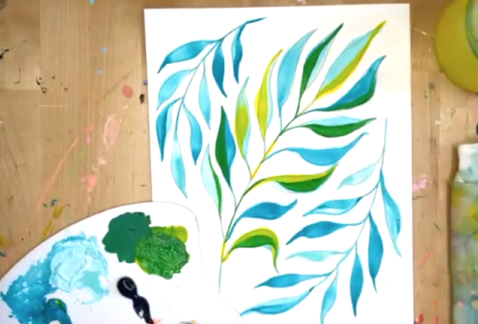
Step 4: Second Layer - Adding Color: Yellow
Now, it’s time to start adding color to our center leaf! We’ll be adding hits of color in layers to achieve a layered colorful look. You can add a little water to your paint to help it flow better, but you want these colors to be more opaque than the initial watercolor wash we created.
The first layer of color will be yellow! I’m using Primary Yellow straight out of the tube and adding it to random parts of the center palm.
Here’s what mine looked like when I finished this layer.

Step 5: Third Layer - Green
Next, repeat the same process but with a kelly green color. This will add depth and give the leaf a more recognizable leaf look. Here’s what mine looked like when I was finished.
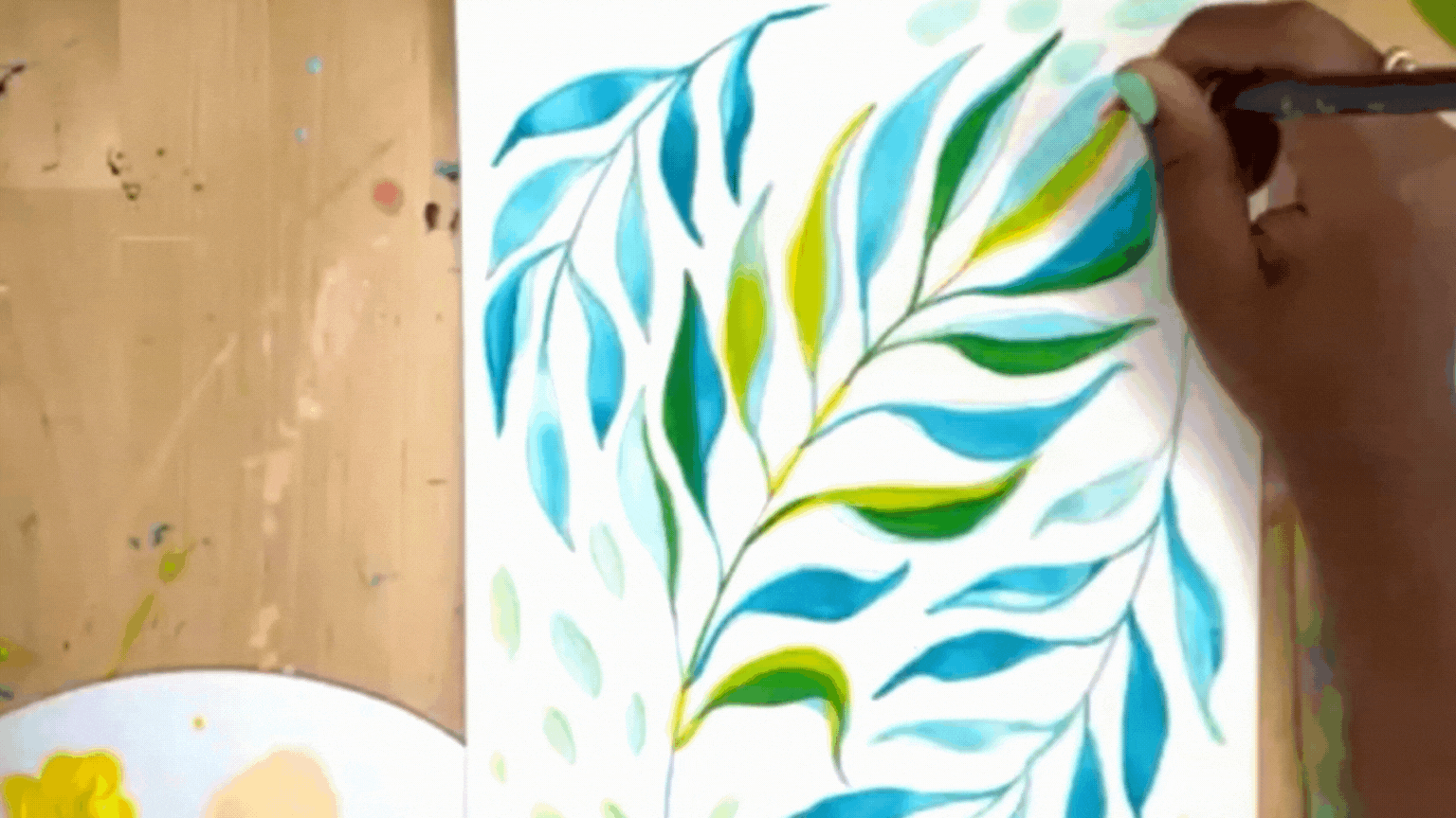
Step 6: Flourishes
While you’re waiting on the center leaf to dry, add a few flourishes to bring the composition together! I added a few brushstrokes to my piece to increase the movement of the piece and fill in the gaps between the outer and inner leaves. Make sure your brushstrokes follow the movement of the leaves and tie things together! I used light turquoise and green to match the color of the leaves, but feel free to make a creative choice and use any color you’d like!

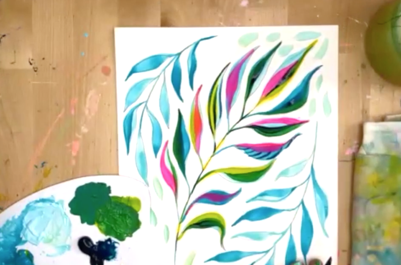
Step 7: Fourth Layer - Fluorescent Pink
Now it’s time for my favorite color, pink! Start adding some hits of pink throughout your leaf and overlap with areas of the existing yellow and green to create interesting color blends and new pops of color.
Step 8: Fifth Layer - Prussian Blue
Our next layer is going to be a dark one - Prussian Blue. This gorgeous deep blue is perfect for adding shadows and depth to your leaves. Just be sure to use it sparingly so that it doesn’t overpower your piece. I experimented with adding it in small strokes and lines to give the leaves extra texture!
Step 9: Sixth Layer - Highlights
The composition is looking a little dark now, so let’s bring it back to the bright and vibrant space with some fun highlights! I’m going to use peach and orange to add bright hits and highlights to the leaf. As you’re layering the brushstrokes, make sure to leave parts of the existing colors peeking out. This is what’s going to add depth and make this colorful masterpiece truly stand out!

Step 10: Final Accents
While you’re waiting for your center leaf to dry, you can start adding some fun hits of gold to the outer leaves. I used a gold Posca paint pen to add gold veining and dots to these leaves to help them pop!

Once your center leaf is dry, come in and add some fun flourishes in whatever way your creative heart desires. I added gold, white, and Prussian Blue embellishments as the final touches to bring my painting to life. Here’s how mine turned out!

Et Voilà! Your colorfu masterpiece l is complete!
At the end of the day, I want you to feel empowered to make this piece your own. Don’t be afraid to make a bold move and add some elements that feel unique to you!
I would LOVE to see what you made! Share your painting on Instagram and tag me @ettavee so I can see what you made!

Want more abstract painting instruction? Join me in my abstract painting class, Joyful Abstracts, for an in-depth art class where I walk through my entire abstract painting process from start to finish. You’ll learn how to gather inspiration, how to sketch out your composition, what colors to choose, how to paint a balanced abstract, and how to varnish your painting so it will last a lifetime!
xo, Jessi

Pin this post for later! 📌
Hover or tap on this image and click the “Save” button on the top left!
